Press Kit
Get inspiration
Interview with the founder http://www.storybench.org/how-colombias-datasketch-wants-to-make-data-visualization-easier-for-latin-american-newsrooms/
Some important points
- Democratize data access to small organizations
- We work to humanize information
- Many difficult problems to solve require humans to organize the data
- There are lots of data but only few people know what to do with it
- Data is difficult to find and communicate
- Not all organizations have the resources to hire a data scientist, a programmer or a designer
- Telling stories with data is not so straight forward if you do not have technical knowledge
Questions
Why are we doing this
A lot of folks use different tools for data visualization, but found it frustrating and expensive. They are not open, you cannot easily tweak them, and some times too complex to work with if you are looking for something rather simple or specific.
We have seen that large news organizations (New York Times, the Guardian) are leaders in data visualization and have a technological edge in data-driven reporting. That widens the gap between them and smaller newsrooms worldwide that do not have a strong technical team. We believe this is particularly important in developing countries where news organizations play a big role in improving data literacy, helping local communities keep pace with innovation in a world increasingly driven by data and algorithms.
What are we building
We are working on an open source web-based data visualization tool. We expect this tool to democratize organizations’ capacity for building great data visualizations as well as radically improve their data workflow. Non-technical users can upload data in multiple formats and get insights with the creation of maps and charts.
We don’t want to build a single ultimate solution for all things data, instead we want to leverage open source to build multiples specific solutions. With our web data apps, users will be able to easily create basic charts and maps of any country or city. We will also be rolling tools for data cleaning and accessing open data from different countries.
Right now, available solutions do not necessarily allow you to use and re-use the data uploaded by other users. We, on the other hand, we are continuously adding public data sources relevant for journalists, like basic demographics, voting results, public procurement, and relevant information about politicians and parties.
What technologies are you using for this
Each data app is built using R, the Shiny framework and Htmlwidgets. The latter allows us to package any data visualization JavaScript library, providing a framework to scale the available visualization options for users. From general visualizations like making a map of the world, to something more specific like alluvial diagrams for budgets, we want journalists worldwide to have access to data and visualizations that are relevant to their own communities. Whether that’s a map of neighborhoods in Medellin or the data and charts of air-quality data in Berlin.
Is it free?
Anyone can install their own version for free, but we also offer a hosted solution with advanced features.
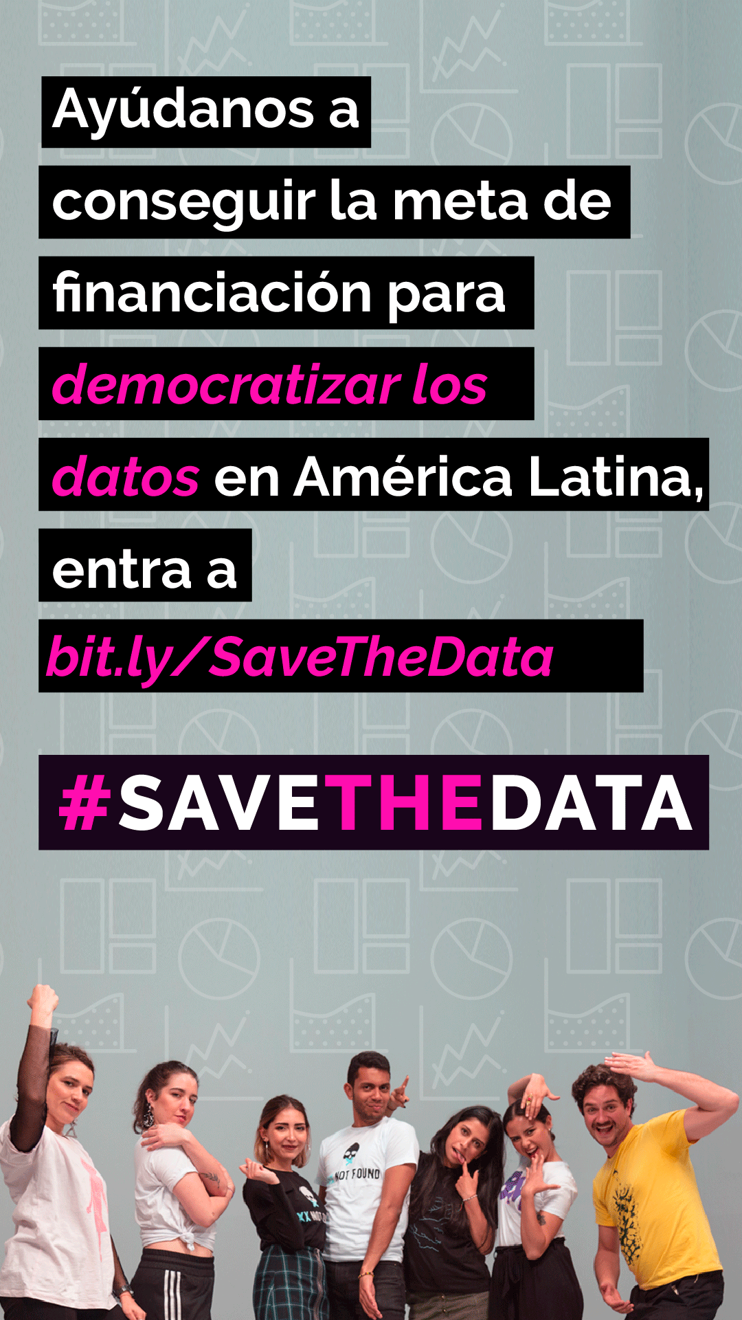
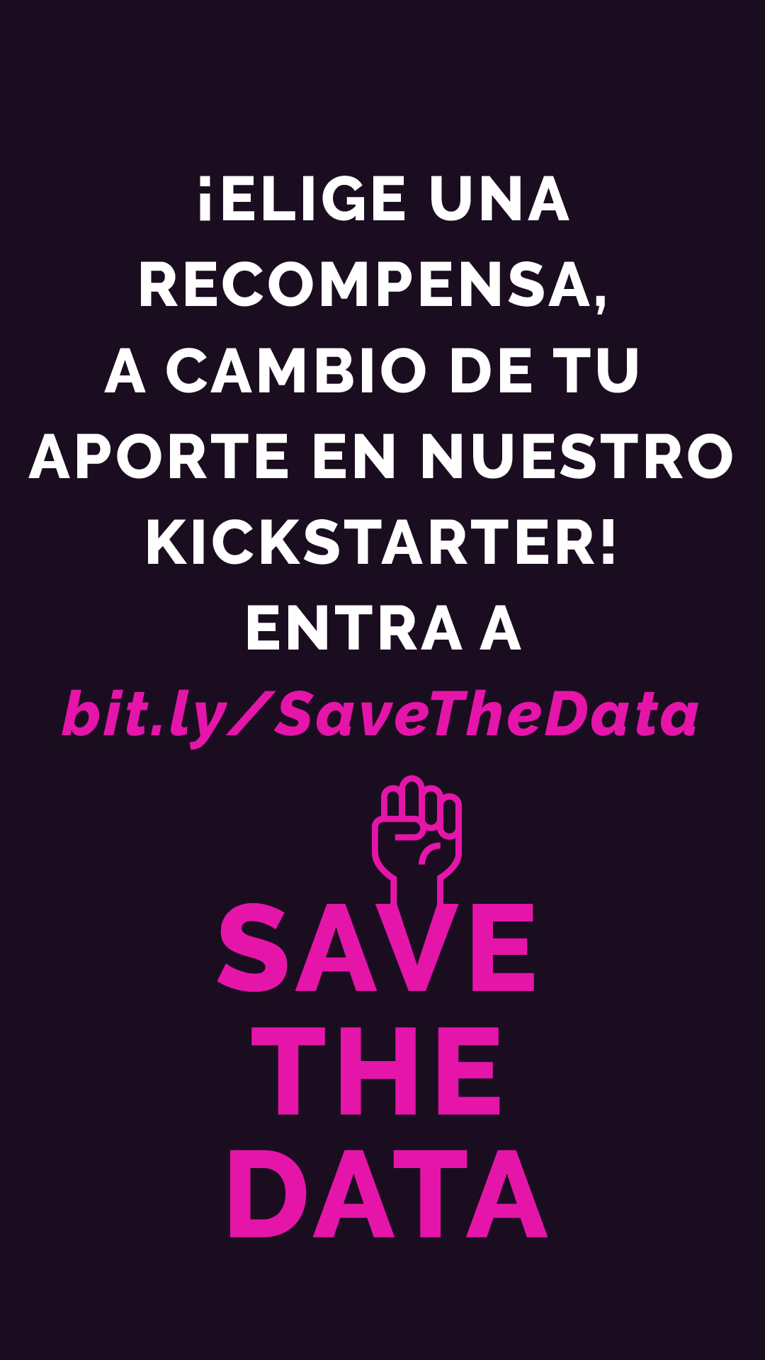
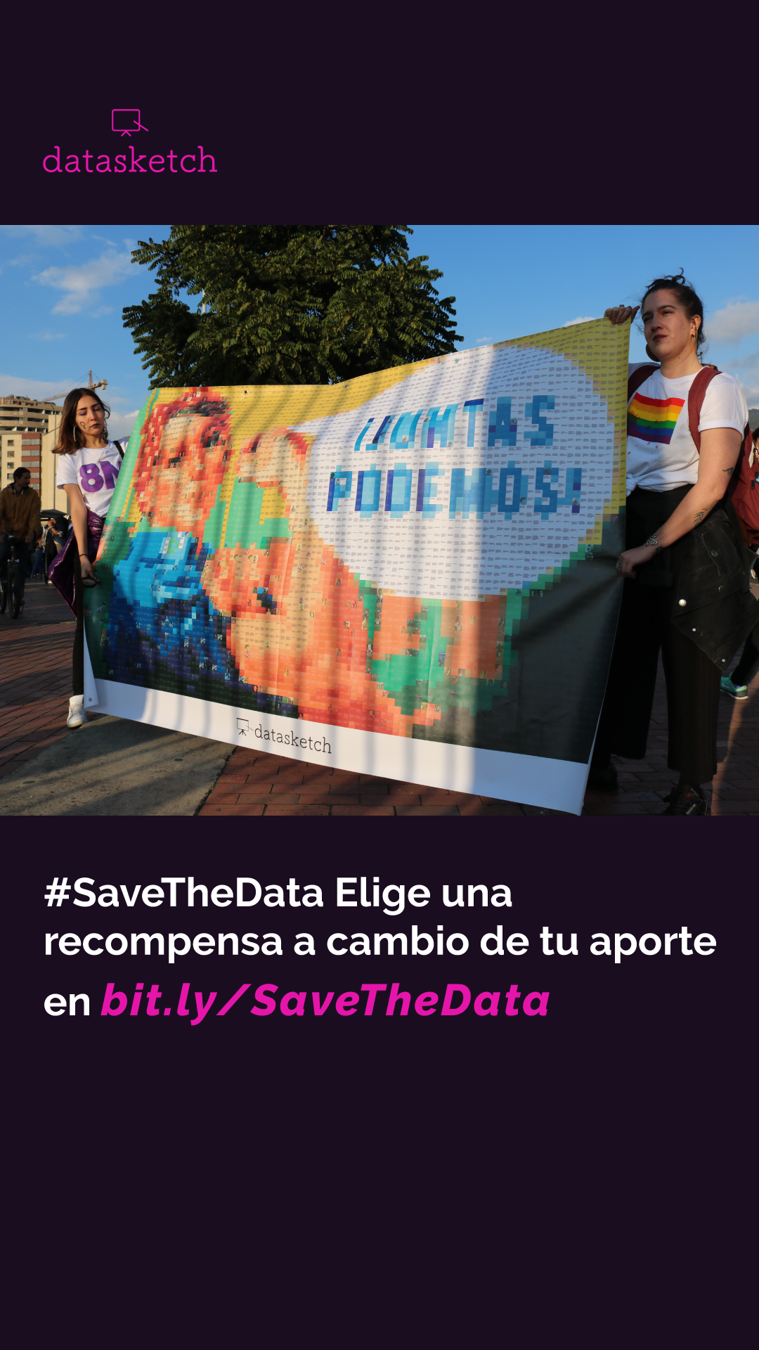
Esta campaña va a disponibilizar herramientas de fácil uso para analizar, acceder y visualizar información. Queremos potenciar a individuos y organizaciones en países de América Latina para atacar problemáticas locales por medio del uso de datos.
Queremos crear 30 aplicaciones web para escalar tecnologías de datos con código abierto donde los usuarios tengan una mejor experiencia al interactuar con la informacion. Vamos a mejorar docuemntación documentación y ofrecer el servicio en línea en inglés, español, francés y portugués.
What are you looking for?
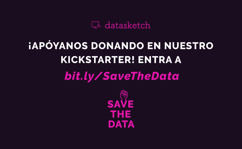
We need support from different users worldwide, so we develop more web data apps for them. That is, we need some financial push, but more importantly we want to work with a community of data enthusiasts, independent of their skill level so we call all tackle important issues using evidence and facts.
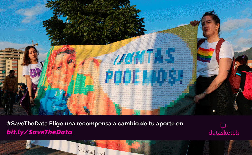
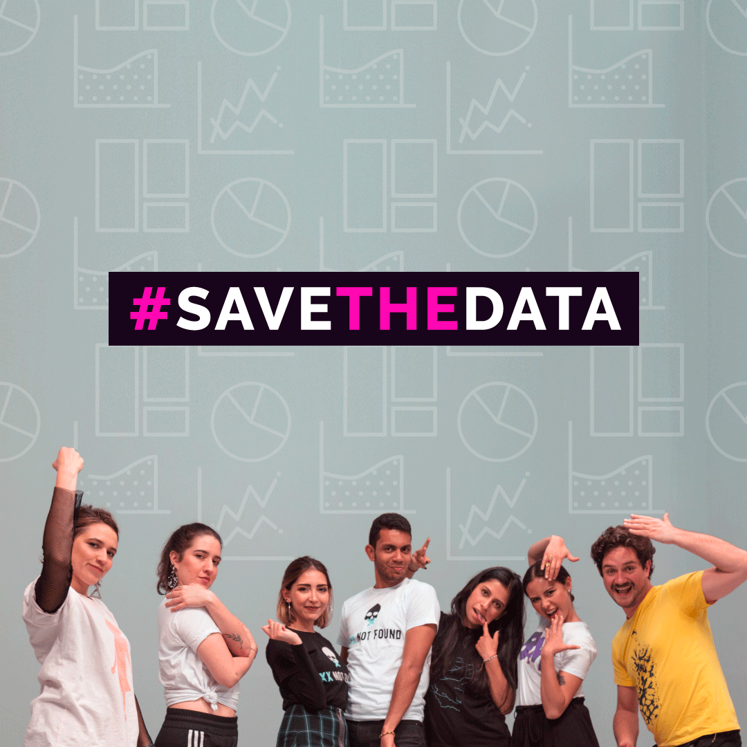
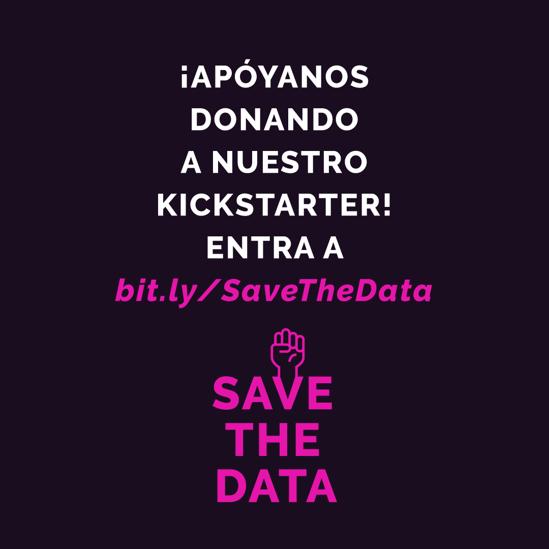
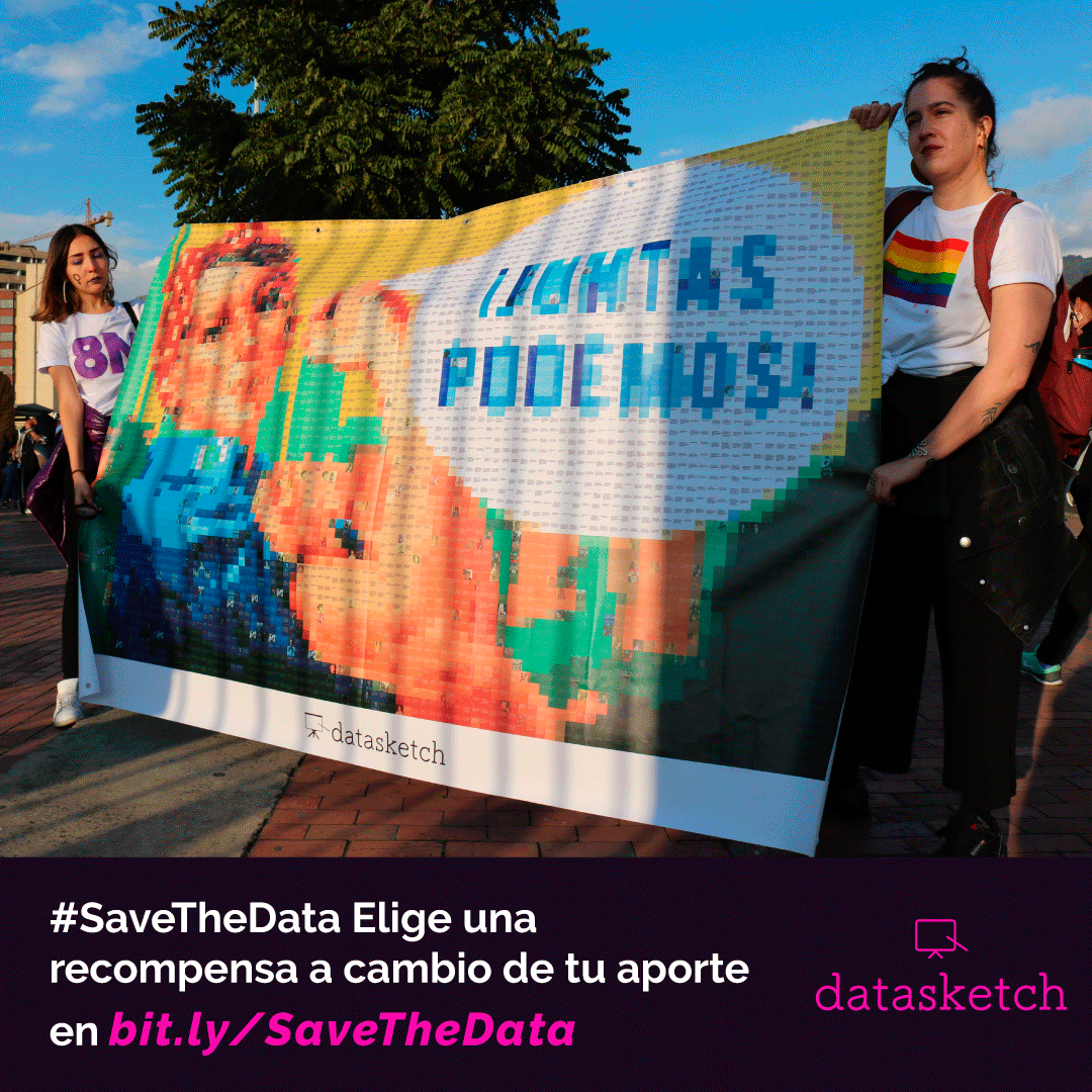
Images